Tuesday, May 10, 2011

Scott Pilgrim vs. the World


I was excited to finally watch this film (and even more happy that it counted for extra credit). From just watching the previews I knew that this movie would be different from other movies based on comic books; Scott Pilgrim vs. the World actually tried to retain the feeling of the comic book throughout the movie. The main way that they accomplished this was using text, color, and animated images throughout the film. Every time that there was a sound or emotion that needed to be emphasized, the style of the movie changed. Take for example the image below when the two characters kissed-- the background gets a pink color added and hearts start floating around. Together both elements place more focus on the kiss and remind viewers of the movie's comic book roots. Additionally there were other parts in the movie were text would come on the screen and make words literally pop out at the viewer. 


Final Part 2.2


4. The 1968 Nixon cover of Esquire undermines the credibility of a contemporary political figure through the use of visual, rather than verbal, associations. Examine images of the 2008 election campaign and offer an example of a similar approach -- an image of Obama, McCain, Palin or Hillary Clinton that makes a powerful visual statement that undermines their campaign or image. Compare and contrast with the Nixon example. 


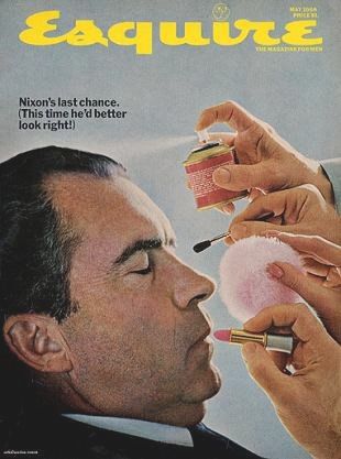
This Esquire cover of Nixon in 1968 sought to undermine his reputation and credibility. Based solely on the visual images one can quickly determine the message the magazine was trying to get across. The cover portrays Nixon as someone who can't do anything without a little help of some cover-up. He has a team surrounding him that are always there to make him look better than what he really is. By wearing make-up and being made-up, the public gets the idea that he does is put on a facade. 

These political attacks on candidates have continued through the years and were present during the 2008 political campaign. During this election candidates were attacked from left and right for numerous reasons. One of the favorites to attack was Sarah Palin. After holding the position of governor of Alaska, she was nominated to run for the Republican vice-president nominee. Many people doubted he ability to handle the position and they attacked her for every move she made. Since she was from Alaska, she was often associated with the rugged lifestyle that included hunting and fishing. However, there was also the simple fact that she was a woman. The cartoon below mocks Palin's identity--- she is woman running for a (traditionally) male's position. The helmet and gun make her look tough and strong, but she's still a woman in a dress holding a baby. Even without the bubble quotes to the side, the viewer still gets this message from just the image. 


This other image below mocks Palin's capabilities, both as current governor and future president, in foreign policy. After her infamous interview (check it out here!), she was criticized that she doesn't know what she's doing and what she will be getting into. Many claimed that she has no actual experience in foreign policy, but because she is in close proximity to two foreign countries she believes she does. The image below takes this idea a step further. They portray as Palin believing she can do anything if she has the tiniest experience (or proximity) to it--- in this case she's an astronaut because she can see the moon. This image does have accompanying text, but if someone is familiar with the interview above I think they will be able to associate the image and interview together. 


Lastly I also found this image of Bill clinton New York Magazine. This was a direct attack on Bill Clinton's masculinity when there was talk that Hilary Clinton would run for president. If elected Hilary Clinton would have been the first female president, and instead of a First Lady there would have been a First Man. For the first time it would be a male in the backseat taking the role a woman would traditionally fill. In this image Bill Clinton's face has been photoshopped onto the body of a woman making him look like... a woman. It's so simple, but it completely undermines Bill Clinton's masculinity. He is not portrayed as a man would be (in a clean suit with tie), but rather dressed up in a red dress and pearls like many First Ladies of the past have been. 


Final Part 2.1

1. Examine Bayer's "Great Ideas" advertisement (page 347, Meggs). Compare Bayer's association of the female image with excess and corruption with contemporary treatments of women in ads. Do we still see this same association? If so, how has it changed? Is it now seen as a good thing or a bad thing? Use at least two contemporary ads. 


Bayer's ad is a collage of tempting evils--- money, gambling, (expensive) food and wine, diamonds, and even women. By including women into the ad Bayer transforms the woman from a a someone to a something. In short, he objectifies women. The woman becomes part of a group of things that are associated with excess and corruption. 


Today, ads still continue this practice of objectifying women and associating them with excess and corruption. The most obvious way they get this message across is using sexual appeal. Looking through a magazine, it is easy to find that good majority of the ads featuring women have some sex appeal. Most of the time the woman is shown as someone beautiful who gets what they want. Take for example the ad for X-Bra. It has a woman dressed in nothing but a black bra and shawl barely covering her arms; the quote below it says "Buy one X-bra, get free drinks." The look of the ad screams sex, but the quote reinforces the idea that women can use their body as a tool to get what they want. And what they want is more things (drinks and whatever that may lead to in this case). This degrades women down to just sex appeal and thus women are seen as objects (objects that can be used to sell pretty products). Women are also seen as corrupt because they use their body to get what they want. By wearing a sexy little bra they can coerce free drinks out a man and anything else they many want. Therefore once again associating women with a bad reputation just as Bayer did in his ad. The second ad on the right demonstrates how women are still also associated with excess. This ad shows a women sitting on a couch surrounded by shopping bags with just one word for a description: "Jackpot." The quick message you get from it is that women love shopping for lots of unnecessary things. 


Another thing that we often see in today's ads is women portrayed in traditional gender roles. It's hard to get women out of those roles when they have been around for so long. Very few ads try to take the women out of that role, but most don't or they make the women appear more "modern." Take for example the ad below. You see a woman dressed up in business attire, so it makes you think she might have a job outside of the home (something"professional"). This is modern because during the mid 20th century women generally stayed home and men worked. Even her attire is updated, she's wearing pants and not a frilly dress or skirt. However, the primary message that you get from the ad is that her "job" is really more associated with the traditional homemaker--- she takes care of/deals with the kids at home. The ad says her job is to be a mother first, and then maybe whatever career she may have comes second. 

AL Relief Poster

After studying Lester Beall's posters for the Rural Electrification Administration, I tried to apply similar elements into my own poster advocating relief efforts in Alabama. The obvious similarity is the limited color palette-- red, white, and blue plus one black and white photograph. Many of Beall's works stuck with this color palette. Red, white, and blue are America's traditional colors and often evoke a sense of pride and unity whenever seen together. In my poster I tried to combine the use of these colors, elements of the American flag (white stars and red/white strips),and the Alabama "A" (to steer attention to the state of Alabama specifically) with the phrase "All for one, one for all" to evoke similar feelings. The phrase is particularly important and wraps up the whole image together. I wanted to show that  we are all part of one nation, and as individuals of that nation it's our responsibility to help those in need.


I posted it here!